Pontifications
- Part 1, Part 2
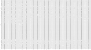
- First, here’s the output. The difference from part 1 is that the roughly 600 colournames from the
plotrix R package are used so there are 600 values on the y axis not 100K:
csv_url = "https://raw.githubusercontent.com/rtanglao/2016-r-rtgram/master/JANUARY2016/january2016-ig-van-avgcolour-id-mf-month-day-daynum-unixtime-hour-colourname.csv"
average_colour_ig_van_jan2016_colourname = read_csv(csv_url)
plot =
    ggplot(data=average_colour_ig_van_jan2016_colourname)+
    geom_point(mapping = aes(x = hour, y=colourname))
filename = "part3-naive-january2016-ig-van-avgcolour-id-mf-month-day-daynum-unixtime-hour-colourname.png"
  ggsave(filename,
         plot,
         width = 53.333333333,
         height = 29.069444444,
         dpi = 72,
         limitsize = FALSE,
         bg = "transparent"
         )
- All the dots are black since there is no colour aesthetic.
- This RScript was invoked as follows:
cd JANUARY2016
Rscript ../part3-create-naive-scatterplot-colourname-hour.R
- In Part 4, we’ll create a visualization with the dots coloured according to the colour names.
Leave a comment on github